
// Brand kit
Actionable logo and brand kit
Everything you need to write about Actionable: the official logo in SVG and PNG, colours, typography, patterns and team photos, with the rules to follow when you use them.
ZIP · 1.9 MB · logos, patterns, photos// Logo
Actionable logo: the wordmark
Write “Actionable”: one word, always a capital A. Use the wordmark in every reference to Actionable, as space allows.
The wordmark is the Actionable name set with its bolt symbol. It is designed for dark backgrounds. The black version is the only one made for a white background.



// Logo
Actionable logo: the symbol
The bolt on its own.
Use the symbol alone only where space is tight, such as a profile picture or an app icon. Everywhere else, use the wordmark.
SVG files scale without losing quality, so they suit print and web. PNG files are ready for slides, documents and social posts.




// Colour
Actionable brand colours
Near-black, warm white and one electric blue. The palette is deliberately narrow. Click a colour code to copy it.
Near-black and warm white do most of the work. Electric blue is the primary accent and marks calls to action and focus states. Pale yellow is the secondary accent, kept for highlights and brand moments, so it stays rare.
Primary accent
Electric blue
Calls to action, buttons and focus states. As text on near-black, large text only. Hover: #6B85FF.
Secondary accent
Pale yellow
Highlights, labels, figures and key words. Keep it rare so it stays special.
Base
Near-black
Main background. Deep and warm.
Base
Warm white
Text on dark backgrounds. On a light background, swap the two.
Colour pairings
Contrast ratios follow WCAG: 4.5:1 is the minimum for body text and 3:1 for large text and buttons.
Do
Warm white on near-black
The default for text and interfaces.
Near-black on warm white
For light backgrounds and primary buttons.
Pale yellow on near-black
For highlights, labels and figures.
Warm white on electric blue
For buttons and large text only.
Electric blue on near-black
For large text and interface elements only, not body text.
Don’t
Pale yellow on warm white
Almost no contrast, the text disappears.
Warm white on pale yellow
Almost no contrast, the text disappears.
// Typography
Actionable typography: three typefaces, one weight
Hierarchy comes from size, tracking and opacity, never from bold. All three typefaces are free to download.
Funnel Display sets the headings, Public Sans carries body text and the interface, and Geist Mono is used for small labels, figures and eyebrows, usually in uppercase.
All three are available on Google Fonts, so you can install them for your slides and documents.
Predict each customer’s next behaviour. Act before it’s too late.
Public Sans
Body and interface
// Patterns
Actionable patterns and textures
We love textures. Use these patterns as a base for your own layouts.
Patterns are a background texture, never the main subject. Keep them to hero and call-to-action moments, fade them toward the near-black base, and keep text clear of the busiest area.
Textures

Pattern 1, white
Download Pattern 1, white

Pattern 2, yellow
Download Pattern 2, yellow

Pattern 3, yellow
Download Pattern 3, yellow
Graphic patterns
Graphic pattern 1
Download Graphic pattern 1
Graphic pattern 2
Download Graphic pattern 2
Graphic pattern 3
Download Graphic pattern 3
Graphic pattern 4
Download Graphic pattern 4
Graphic pattern 5
Download Graphic pattern 5
Graphic pattern 6
Download Graphic pattern 6
Graphic pattern 7
Download Graphic pattern 7
Graphic pattern 8
Download Graphic pattern 8
Graphic pattern 9
Download Graphic pattern 9// Rules
Actionable logo usage rules
Provide plenty of space around the logo. Make it big or small, but give it room to breathe, never cramped or cluttered.
Use the wordmark in every reference to Actionable, as space allows. Use the white version on dark backgrounds. If you have no choice but a white background, use the black version, the only one made for it.
Write Actionable as one word with a capital A. It is the name of both the company and the application, so say “Actionable”, not “Actionable app”. The Actionable graphics are proprietary and protected by intellectual property laws.
Do
Use it on dark
The white logo is designed for dark backgrounds.
Use black on light
On a white background, use the black version. It is the only one made for it.
Use white on electric blue
The white logo also works on the electric blue of the brand.
Don’t
Do not stretch
Never distort the proportions of the logo.
Do not recolour
Only use the white and black versions provided.
Do not add effects
No shadows, outlines or glows.
Also avoid
- Do not alter the logo files in any way.
- Do not recolour, stretch, rotate or add effects to the logo.
- Do not place the white logo on a white or light background.
- Do not use the logo in a way that implies a relationship, affiliation or endorsement by Actionable.
- Do not use the logo as part of your own product, business or service name.
- Do not combine the logo with other graphics without written consent from Actionable.
- Do not write “Actionable app” or change the capitalisation of the name.
// Team & founders
Actionable team and founders photos
Use these photos when you talk about the people behind Actionable, including our two co-founders, Nans and Nicolas.
The photos are provided as they are. Please do not alter or recolour them, and credit Actionable when you publish them.
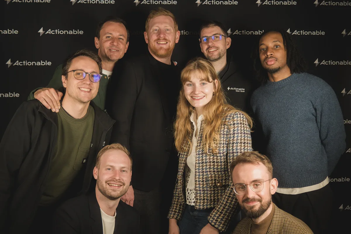
The Actionable team
Download The Actionable team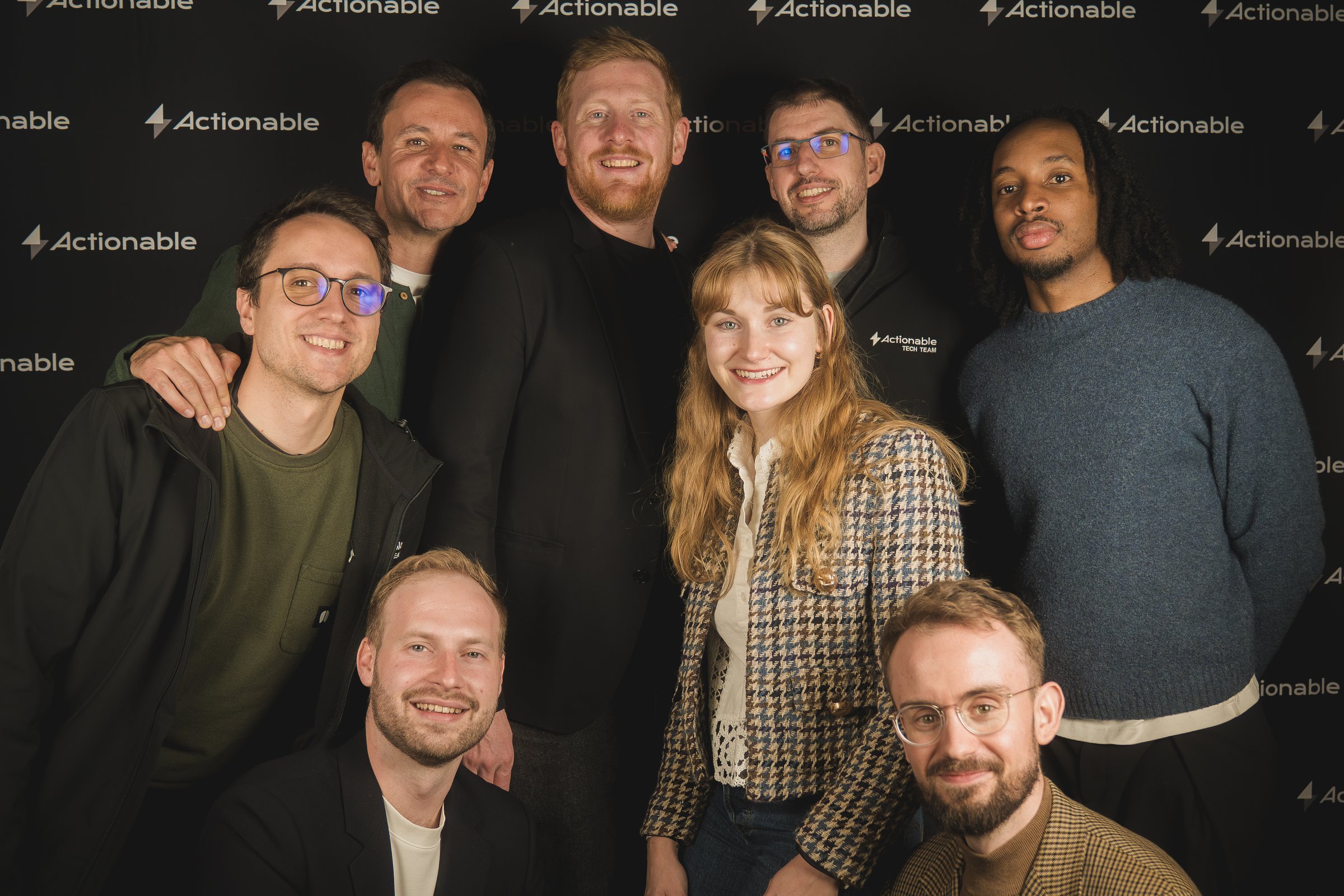
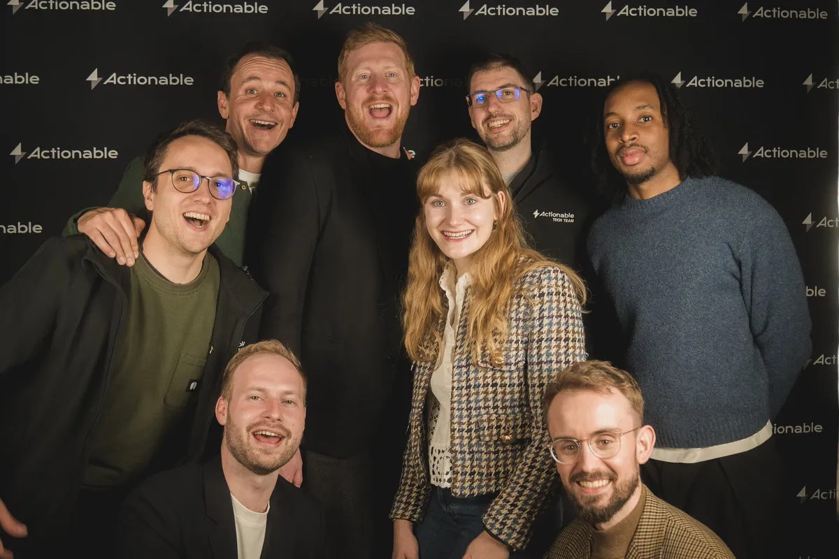
The Actionable team, second take
Download The Actionable team, second take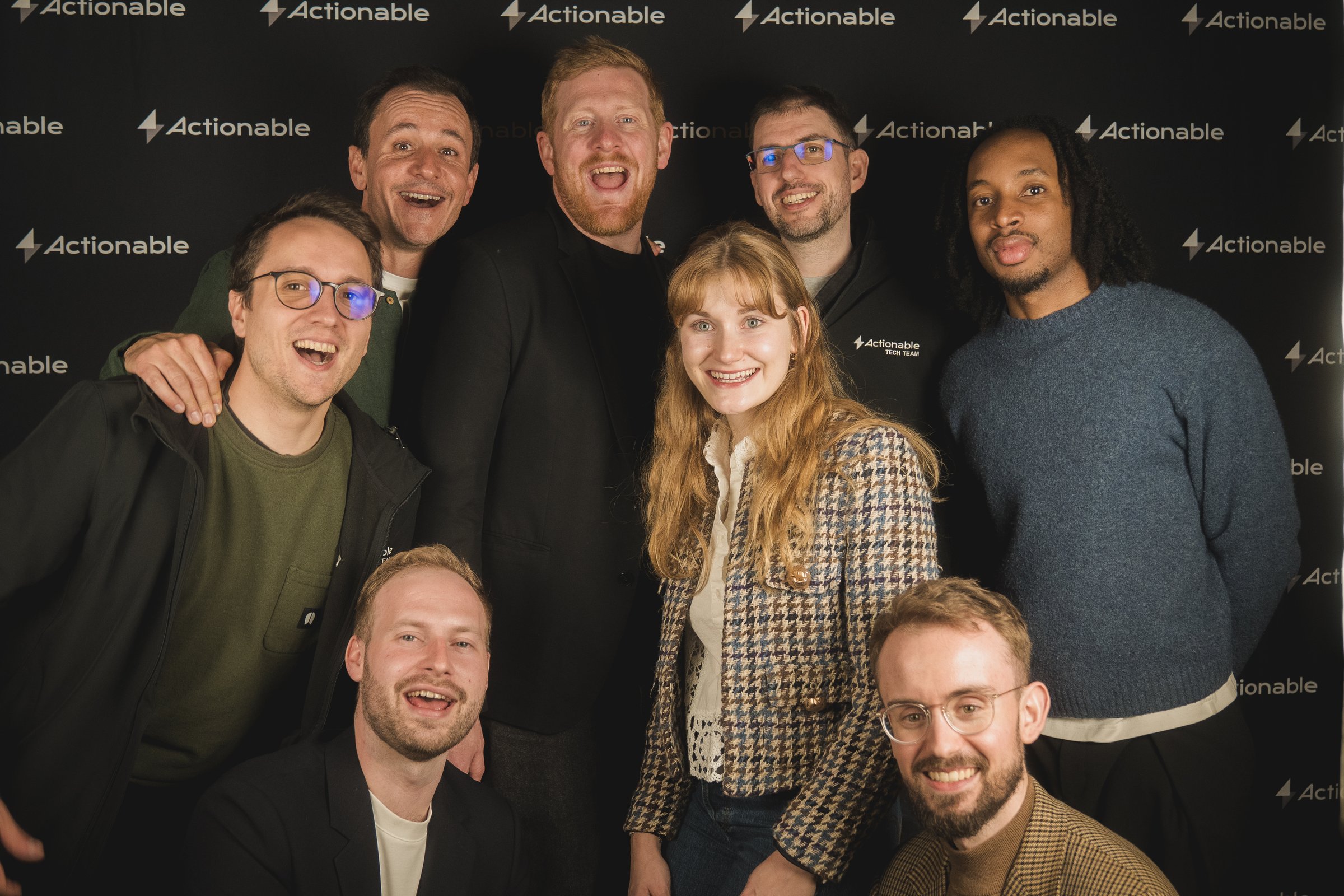
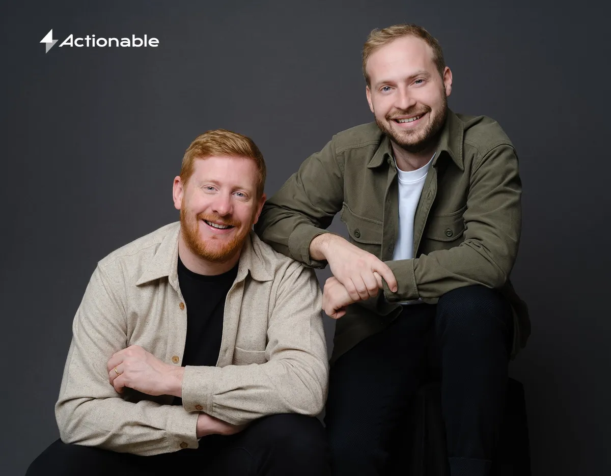
Nans and Nicolas, seated
Download Nans and Nicolas, seated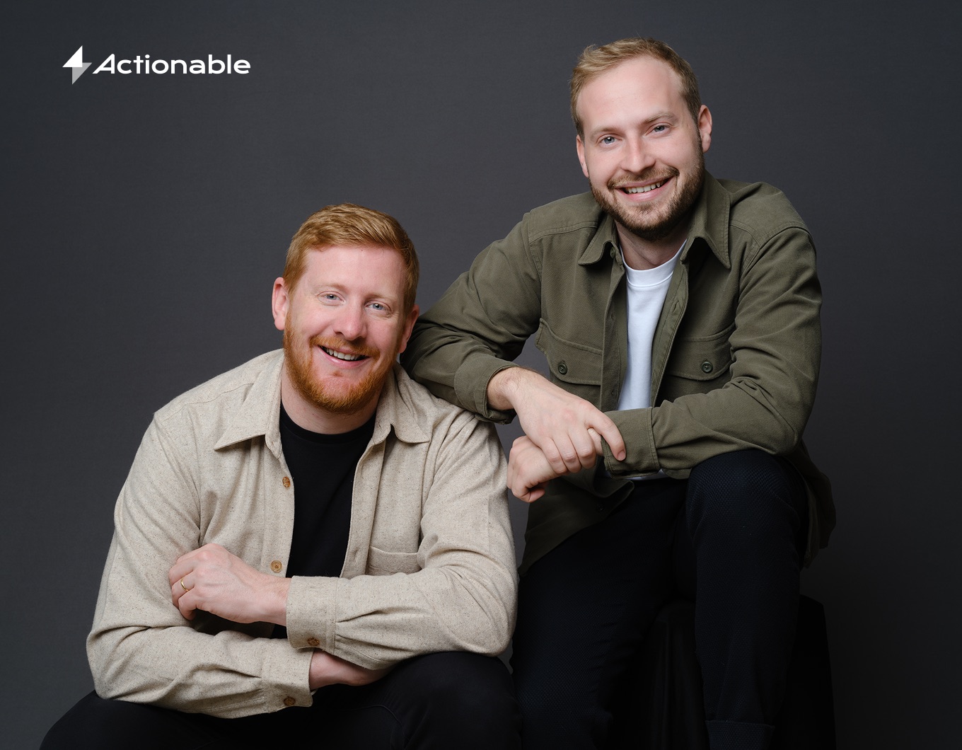

Nans and Nicolas, standing
Download Nans and Nicolas, standing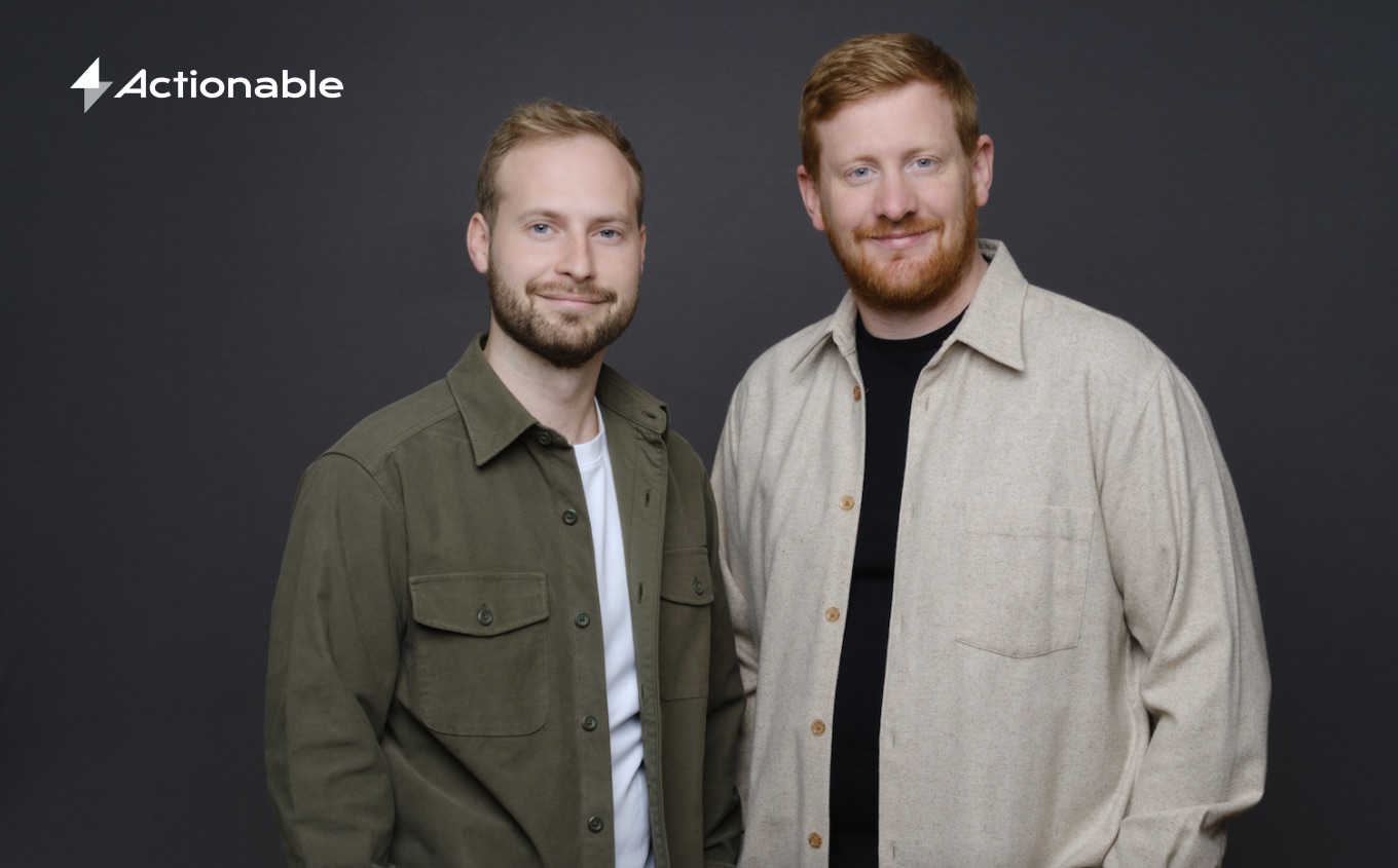
Need something else?
Download the full press kit, including logos, patterns and team photos. For press inquiries, email us at hey@actionable.live and we'll be happy to help.